fallback


The need for a colour check is not just for websites!
A real-world experience with a credit card
My elderly father has been hospitalised for some time but will be coming home on Monday. This news brings immense relief and joy to our family. However, in preparation for his return, we have encountered some unexpected challenges that highlight a critical issue: accessibility in design.
Just the other day, we were trying to top up his mobile phone. It seemed like a simple task—call the mobile phone company, provide the necessary details, and voila! But as life would have it, things are rarely that straightforward. My father wanted to use his credit card for the transaction. As I was on the phone with the customer service representative, ready to read out his card details, I hit an unexpected roadblock.
The credit card numbers were printed in a colour that was exactly the same as the background. Imagine trying to read something that is virtually invisible. It was a nightmare, especially since I did not have my assistive technology (glasses) with me. Squinting and straining my eyes, I tried to make out the numbers, but it was almost impossible.
An alternative solution that made a colour check easier!
After several frustrating minutes, we eventually sorted it out by using his other card, which thankfully had a strong, contrasting background that made the numbers easy to read. While this solved our immediate problem, it made me realise, once again, how vital it is to consider accessibility in any form of design. This was not just a minor inconvenience—it was a significant barrier.
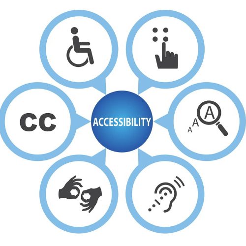
Accessibility in design is not just about ticking boxes on a compliance checklist. It is about ensuring that everyone, regardless of their physical abilities, can access and use a product or service with ease. Whether it is the colour contrast on a credit card, the font size on a website, or the tactile feedback on a keypad, these details matter immensely.
When was the last time you found colour contrast to be an issue? For me, this experience with my father's credit card was a stark reminder. But it does not stop there. Think about all the places where poor design can impede everyday tasks: websites with light grey text on a white background, important signage with insufficient contrast, or even instructions printed in tiny, faint font.
When was the last time you found colour contrast to be an issue? For me, this experience with my father's credit card was a stark reminder. But it does not stop there. Here are some stories others have shared with me about their own experiences with poor colour contrast:
- "For me, the biggest offenders right now are kids' books. Dark text on a dark background is common. I've been taking a wild guess at what some of the words say and then I get corrected by a 4-year-old."
- "I stopped using my Hotel Corporation card because the dark grey on light grey background (no more raised numbers) was impossible for me to read."
- "I was with my elderly parents at a medical appointment and the colour contrast on the rotating slideshow on the digital display made the slides very hard to read. The content was great, but the presentation made it challenging to read."
- "There are some combinations of red and blue that make my eyes hurt. That's despite having no visual impairments (other than being a little short-sighted)."
Before you design, think - colour check!
As someone who occasionally needs glasses, I often find myself struggling with these design flaws. It is a constant reminder that good design should be intuitive and accessible to everyone. It is about empathy and understanding that our needs can change with time, age, or circumstance.
So, the next time you are involved in a design project, be it a website, a product, or even something as seemingly mundane as a credit card, think about accessibility. Consider how the design will be experienced by someone with visual impairments or other disabilities. Sometimes, it is the smallest changes—like adjusting colour contrast—that can make the biggest difference.
Let us strive to create a world where accessibility is the norm, not an afterthought because everyone deserves to navigate their daily lives with ease and dignity.
If you like our help, please book a chat with us.


Would you like to speak with people
who understand inclusive web design?
Whether you are planning a new website, reviewing an existing platform or trying to understand your accessibility obligations, we would love to help.
Please get in touch to discuss your project, accessibility goals or digital challenges.