fallback

A Quick Guide to Minimalistic Web Design
One design style that never goes out of trend is minimalistic. Simple lines, lack of clutter and subtle hues are pleasing no matter what decade it is. The style also tends to not look dated, giving websites time to upgrade at their own choosing instead of trying to keep up with trends. Minimalism meshes well with other styles. You can add in a few trendy items without your site getting dated.
Are you wondering how to define minimalistic web design? Even expert designers sometimes become confused about exactly what minimalistic web design means. After all, you can combine minimalism with nearly any other theme you can imagine, including punk or beach themes. Minimalistic is more of an attitude and attention to cutting clutter than anything else.
What Makes a Design Minimalistic?
Britannica indicates minimal art is also called ABC art, and comes from Russian painter Kasimir Malevich in 1913, when he put a black square on a white background for his modern art. Some would argue minimalism has always been around from the first moment the first caveperson threw out some of their items because things were getting too cluttered.
What exactly is minimalistic design? More than a definition, it’s a movement. Think Marie Kondo visited your website and joyfully threw away anything you didn’t need and you’ll get an idea of the overall feel of minimalism. To embrace the characteristics of minimalist design, make sure you follow these simple rules:
1. White Space
One thing you’ll notice about most minimalist designs is ample negative space. Designers embracing this style don’t try to fill the page up with clutter. Instead, they focus on sharing only the best things and ignoring everything else. One of the first things you might do if you want to apply a new minimalistic design to your website is to cut the clutter and add more space between elements.
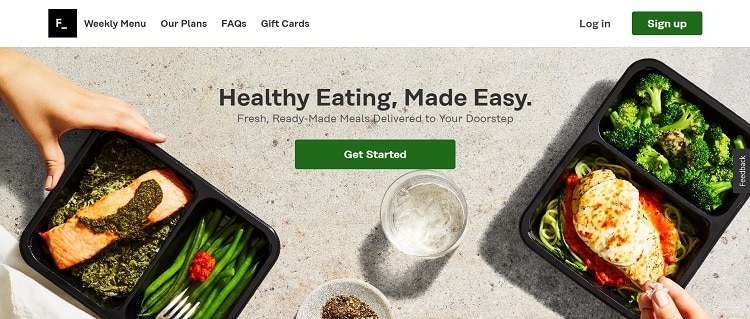
Source: https://www.factor75.com
Factor offers a ready-made meal delivery service made up of simple meals. A minimalistic web design is a perfect match for the company philosophy. Note how the only things the user sees when they land on the site is the logo, a simple navigation bar, a hero image, a headline and the call to action (CTA) button.
Note the extra space around the CTA button, the headline and between the hero image and the navigation bar. Even the hero image serves as a sort of negative space while still setting the tone.
2. Monochromatic Palette
A look at over 100 minimalist websites uncovered that around 95% of them used monochromatic color palettes. One way to keep your design focused only on the most crucial elements is to stick to a limited color scheme.
You can choose various shades within the same color family for a monochromatic look or go with just a couple of hues, such as black and white or tan and brown. A navy blue, medium blue-gray and soft blue can all mesh together for a simple, beautiful and highly luxurious look.
3. Clean Lines
Another characteristic of minimalistic web design is clean lines with a clear separation between elements. You’ll often see simple, beautiful websites set up on a grid. Make sure things have crisp, clean edges and are aligned across and down the page.
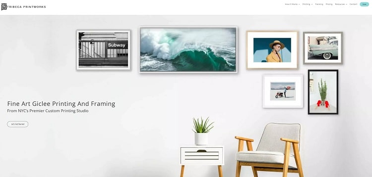
Source: https://www.tribecaprintworks.com
Tribeca Printworks used clean simple lines to create a minimalistic design. Note how the frames have straight edges, the wall is a simple white with a few subtle shadows. Even the chair and table have very simple lines without curves or geometric shapes.
4. Simplicity
Another element of minimalist design is going with what is simple. Choose flat icons, single color text and even a font that isn’t extremely decorative. The sharp, clean edges of a sans serif font work particularly well with this style.
When choosing images to include in your design, go with ones that stick to a single color scheme. You don’t want a rainbow exploding on your beautiful, clean page.
5. Singular Focus
Minimalism doesn’t try to be everything to everyone. Figure out what your message is and who your target audience is. Hone in on a singular focus and make sure every element on the page points back to your primary goal.

Source: https://www.kerrygoldusa.com
If you’ve ever tasted the simple, deliciousness of Kerrygold butter, then you’ll appreciate their minimalist web design. Everything is laid out on a grid except for the logo, which layers over top of the header and body of the page.
As you hover over each image, you'll see a popup of the ingredients. The text is a simple sans serif in one color on a white semi-transparent background.
6. Symmetry
If you want to take your minimalist designs to another level, think about how each feature on the website works together as a whole. Not only should your users find it easy to move through the buyer’s journey but they should almost be able to predict what is going to happen next.
You’ll find symmetry in the style of each photography you choose to include, in the size, color and font used for H1 and H2 headers and even in the tone of your site. Everything should mesh into a cohesive whole.
Ask for Feedback
How can you ensure your site is as minimalistic as possible? Start by going through the points above. Next, ask for feedback from your users. Is there anything on your site that they don’t understand or seems out of place? Finally, get feedback from experts in the industry. Is there anything you should cut to make your site more functional?
Guest blog written by Eleanor Hecks is the EIC of Designerly. She’s also a web design consultant with a focus on user experience and style guides. She lives in Philadelphia with her husband and golden doodles, Bear and Lucy. Connect with her about marketing, design and/or tea on LinkedIn.

Access by Design.
Beautiful, accessible, web design Chichester
Always delivering an outstanding web audit

Would you like to speak with people
who understand inclusive web design?
Whether you are planning a new website, reviewing an existing platform or trying to understand your accessibility obligations, we would love to help.
Please get in touch to discuss your project, accessibility goals or digital challenges.