fallback


20 things about Google - Thing 09 - What is beautiful to Google?
What does a beautiful Google experience really look like? It is not about photos, colours, or animations. Google is blind to visuals. It cannot see your homepage or admire your branding. It judges beauty by structure, accessibility, and the quality of your code. This is where tools like a wcag color contrast checker and proper HTML markup make all the difference. In this blog, we unpack what Google really finds beautiful and how you can design your site to reflect that.
Google Cannot See – But It Can Read
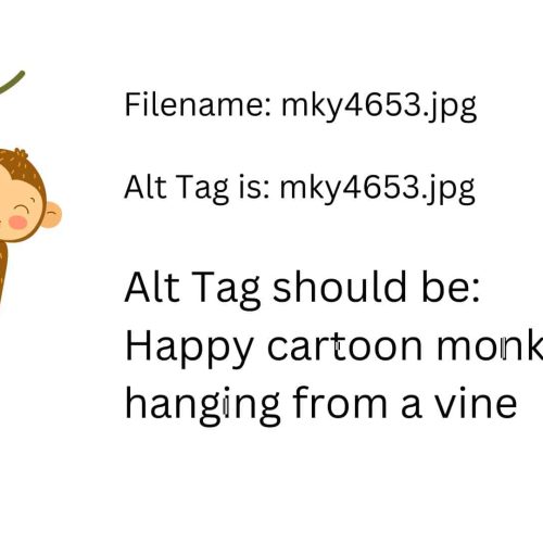
Let us begin with a simple image: a majestic whale breaching from the sea. To us, it is breathtaking. To Google, unless it has the right tags, it might as well be blank space. That is the point. Google cannot see images. It relies entirely on the page code. File names like ThinkstockPhotos-588367274.jpg do nothing. Adding a descriptive filename and alternative text, like whale-jumping-out-of-water.jpg, is a small but powerful improvement.
Yet even then, Google still cannot feel what we feel. So how does it judge what is beautiful?
Beautiful Google Means Beautiful Code
Google’s definition of beauty starts with how well a site is built. Well-written code loads faster, works on more devices, and is easier to navigate with assistive tech. This includes clear heading structures, properly labelled forms, meaningful link text, and keyboard accessibility.
A site full of accessibility and coding errors may still look appealing to a human eye, but to Google, it is messy. And Google does not reward messy. That is why beautiful Google means clean, semantic, standards-compliant code.
The Hidden Power of Contrast and Accessibility
One area many overlook is colour contrast. Without sufficient contrast, people with visual impairments cannot read text properly. Google knows this. Accessibility failures can directly affect search rankings. This is where a wcag color contrast checker becomes essential.
These tools let you test whether the colours used on your website meet WCAG standards. Whether it is dark grey text on a pale grey background, or a light blue link on a white page, you can instantly find out if your design passes or fails.
Why Contrast Affects Usability and Rankings
Low contrast is not just a visual issue. It is a usability issue. If users cannot read or interact with your content, they will leave. That increases your bounce rate, and Google sees this. A site that is hard to use gets punished, even if it looks lovely.
Using a wcag color contrast checker allows you to catch these issues before they hurt your user experience or your SEO.
A Beautiful Site Has Nothing To Hide
A good analogy is one of our clients: Little and Lampert Pianos. They are blind piano restorers who rebuild each instrument with obsessive attention to detail. The result is always beautiful. Not because of decoration, but because of structural quality.
That is how Google sees your website. It pulls it apart and examines every component. It is not swayed by glossy animations or large images. It rewards structure, precision, and reliability. That is what true digital beauty means.
Why Template Sites Fail Google's Beauty Test
Many off-the-shelf templates are not built with accessibility or SEO in mind. They may look good, but behind the scenes, they are riddled with unnecessary scripts, poor heading structures, and contrast issues. If your site was built from a generic template, chances are it is not passing Google’s invisible checklist.
You might not be able to see it. But Google can.
How We Build Websites Beautiful To Google
At Access by Design, we do not just design for users. We design for the crawlers too. That means:
- Clean, semantic HTML
- WCAG-compliant accessibility
- Mobile responsiveness
- High contrast design
- Logical content flow
- Optimised speed and performance
Every decision we make is driven by one simple principle: design for everyone. That includes people with disabilities, screen readers, and Google bots.
Start With an Audit
If you want to know how beautiful your site is to Google, start with an accessibility audit. We will assess your site using tools like a wcag color contrast checker, but we also test it manually using real users with disabilities. The result is a full report of what is working, what needs fixing, and how to move forward.
It is not just about compliance. It is about reaching every potential user and being rewarded by Google or doing so.
Learn more about our accessibility audit


Would you like to speak with people
who understand inclusive web design?
Whether you are planning a new website, reviewing an existing platform or trying to understand your accessibility obligations, we would love to help.
Please get in touch to discuss your project, accessibility goals or digital challenges.