

Glastonbury Tickets: An Accessibility Thumbs-Up
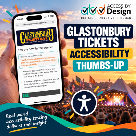
I didn’t get Glastonbury tickets.
That was obviously not the result I wanted. However, sitting in the queue on my phone for quite some time gave me an unexpected opportunity to do something else.
I tested it for accessibility.
This is probably an occupational hazard when you run a web accessibility agency. Give me a website, a mobile phone, a bit of time to kill, and sooner or later I’m going to switch on a screen reader to find out what happens.
In this particular case, what happened was rather good.
The Glastonbury Ticket Queue
Like thousands of other hopeful festival-goers, I joined the online queue for Glastonbury 2027 tickets.
Before sales opened, the page displayed information explaining what would happen once the sale began. There was also a countdown showing the remaining time before the event started.
I need to make one important distinction here.
I didn't test the countdown itself with a screen reader, so I cannot say whether changes to that countdown were being announced accessibly. It would be very easy to look at the screen, see a perfectly clear countdown and declare it accessible.
That isn't accessibility testing.
Accessibility isn't about looking at something and deciding that it probably works. As a web accessibility agency, we need evidence from actual testing before making that claim.
Once I was in the live queue, however, I switched on VoiceOver on my iPhone.
That was when things became interesting.
An Accessible Progress Indicator
The queue included a visual progress indicator.
For a sighted user, its purpose was immediately apparent. As the queue moved, the indicator gradually progressed across the screen.
A visual progress bar is useful.
An accessible progress bar is much better.
Using VoiceOver, I could determine my progress through the queue rather than being presented with an unexplained graphical object. The information wasn't dependent solely upon being able to see the bar.
This may sound like a relatively small detail.
It isn't.
When somebody is waiting for something as sought-after as Glastonbury tickets, uncertainty matters. A sighted user being able to see that the queue is progressing while a blind user receives no equivalent information creates a very different experience.
This implementation gave me that information.
That deserves a thumbs-up. 👍
Clear Queue Information
The page also provided straightforward instructions.
Users were explicitly told not to refresh the page or use multiple devices or tabs because doing so could result in losing their position in the queue.
Users reaching the front of the queue were told they would have ten minutes to enter the website before their session expired.
Later, an updated message explained that more than half of the available tickets had been sold while confirming that the queue for the remaining tickets was continuing to move.
None of this is particularly flashy.
That's partly why I liked it.
Good accessibility frequently isn't flashy. It is information presented clearly, structured properly and made available to people using different ways of accessing a website.
That is precisely the sort of thing we look for when providing accessibility testing services.
Accessibility Requires Real Testing
There is another reason I wanted to write about this experience.
Accessibility audits quite rightly identify problems. Much of our work as an accessibility agency involves finding barriers, explaining their effect on disabled people and helping organisations fix them.
Sometimes, though, we should talk about the things people get right.
The Glastonbury queue gave me an opportunity to experience an important part of a very high-demand customer journey using the same assistive technology that a blind iPhone user might use.
That is much more meaningful than simply inspecting a screenshot.
At Access by Design, our accessibility testing services combine automated testing with expert manual testing because automated tools cannot tell the whole story.
A tool might identify whether certain technical attributes exist.
It cannot experience the frustration of being stuck in a queue without knowing whether anything is happening.
It cannot understand why knowing your progress matters.
It cannot experience the reassurance of receiving useful status information at the right moment.
That requires human testing.
Mobile Accessibility Matters
This experience also demonstrates why accessibility testing needs to include mobile devices.
People don't experience websites exclusively on desktop computers.
I certainly wasn't going to sit chained to my desk waiting for Glastonbury tickets. I was using my phone, exactly as enormous numbers of other people would have been.
A website accessibility agency therefore needs to consider the real circumstances in which people use a service.
How does the journey behave on a smaller screen?
What happens when somebody magnifies the content?
Can somebody navigate using VoiceOver or TalkBack?
Does changing orientation cause problems?
Are controls large enough to operate comfortably?
Does important information remain available when assistive technology is being used?
Accessibility exists in the real world, not merely in an audit report.
Accessibility Beyond Compliance
There is inevitably a technical standards element to the work of any web accessibility agency.
WCAG matters. Success criteria matter. Legal requirements matter.
People matter more.
The ultimate question isn't simply whether a progress indicator technically satisfies a particular WCAG success criterion.
The better question is:
Can the person actually use it?
That distinction sits at the heart of our approach to accessibility testing services.
Compliance gives us an essential framework. User experience tells us whether the implementation actually works.
The best results come from considering both.
A Thumbs-Up for Glastonbury
I didn't get the tickets.
I'm still mildly grumpy about that. 😂
I did, however, come away from the experience with something positive to say.
The part of the Glastonbury ticket queue I tested using VoiceOver worked extremely well. Information was clear, the queue remained understandable, and crucially, the progress indicator communicated useful information rather than relying solely on its visual appearance.
I can't make claims about parts I didn't test, including the countdown before the queue opened.
For what I did test, however, this is a genuine accessibility thumbs-up.
As a web accessibility agency, we're accustomed to telling organisations where accessibility needs to improve.
It's equally important to recognise good work when we encounter it.
So, Glastonbury, you may not have given me a ticket.
You did give me a rather good accessibility case study.
I'll take that as a consolation prize. 👍
Access by Design - Changing the World One Website at a Time.


Would you like to speak with people
who understand inclusive web design?
Whether you are planning a new website, reviewing an existing platform or trying to understand your accessibility obligations, we would love to help.
Please get in touch to discuss your project, accessibility goals or digital challenges.