fallback

What’s the best way to avoid using the c-word?
Expanding on inclusive link text
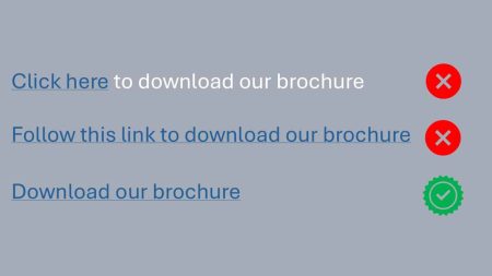
Let’s call out the culprit straight away: “Click here.”
It crops up on every other page, yet for many people it’s about as helpful as a “Wet Paint” sign written in braille and hung face‑down.
Why “click here” falls short
- Screen‑reader users get no context. A blind visitor tabbing through links hears a chorus of identical “click here, click here…”, but zero clue about what each link actually does.
- Keyboard‑only and voice‑control users don’t always click. Tapping Enter, issuing “open” commands or working a sip‑and‑puff switch is hardly “clicking”, so the wording already excludes them.
- SEO and skim‑readers miss out. Descriptive link text doubles as an anchor for search engines and a visual cue for sighted users scanning the page.
Better patterns (short, sweet and inclusive)
| Poor | Better | Even better (with extra cues) |
|---|---|---|
| Click here | Download our brochure | Download our brochure (PDF, 2 MB) |
| Click here for event details | View upcoming events | View upcoming events (opens in new tab) |
| Click here to read more | Read the full case study | Read the full case study on accessibility |
Notice how each improved link tells you what will happen before you activate it—no hidden surprises, no insider knowledge required.
The “mouthful” objection
Yes, “Follow this link to download our brochure” is technically descriptive, but it still buries the verb (download) under throat‑clearing fluff. Trim the fat and you get “Download our brochure”—five words that do exactly what they say on the tin. Job done.
The golden rule
If you can plonk your link text into the sentence “I want to ___,” and it still makes sense, you’ve nailed it:
I want to download our brochure. ✅
I want to click here. ❌
Swap every vague “click here” for a purpose‑led phrase and you’ll tick WCAG 2.4.4 – Link Purpose (In Context), boost usability for everyone and—bonus—look far more professional in the process.

Would you like to speak with people
who understand inclusive web design?
Whether you are planning a new website, reviewing an existing platform or trying to understand your accessibility obligations, we would love to help.
Please get in touch to discuss your project, accessibility goals or digital challenges.