
fallback
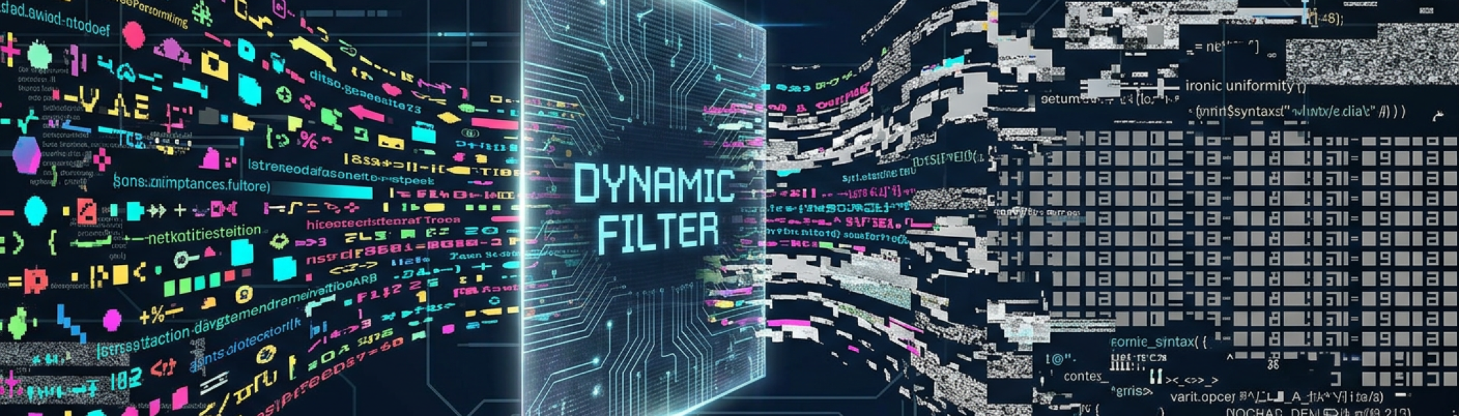
When Dynamic Filtering Creates Problems Nobody Expected
Why dynamic filtering is popular
Dynamic filtering can feel like a smart improvement. A visitor chooses a course subject, an age range or another option, and the results update straight away. No extra button. No obvious delay. No need to think. On paper, that sounds like a cleaner experience.
In practice, it can create problems that are not obvious in a design meeting. A recent project on a college course search showed how a well-meant feature could cause confusion for disabled people, keyboard users and people using assistive technology. The same feature also created a serious resilience concern, as the huge number of possible filter combinations made the search area easier to overload during a sustained attack.
This is not about blaming designers or developers. Dynamic content is used everywhere. It is often built with good intentions. The issue is the law of unintended consequences. A feature that appears helpful for one group of users can quietly make the experience worse for others, while also placing unexpected pressure on the underlying system.
A Helpful Feature With Hidden Risks
Course searches often need filters. Colleges may offer many different options across subject areas, age groups, qualification levels, study modes and locations. Without filters, people would have to scroll through too many choices. Good filtering should help people narrow the list and find the right course with less effort.
Dynamic filtering tries to make this faster. Instead of selecting several options and pressing a button, the results update every time one option changes. That can feel slick for a mouse user on a fast connection who can see the whole page clearly.
The difficulty starts when the page changes before the person is ready. Some people need more time to review the available options. Some use a keyboard and move through controls one step at a time. Some rely on software that reads the page out loud. Some need a clear confirmation that a change has happened. Automatic updates can remove that control.
A page should not only look efficient. It should behave predictably. Predictable behaviour is what lets people build a mental map of the page, understand where they are, and know what action has just taken place.
What Happened On A Course Search Page
The course search had several filters. A visitor could choose a subject area, an age related option and other parameters. Each selection caused the results to update automatically.
The problem was what happened next. After a filter was selected, the page reloaded and focus moved back to the top. That meant a keyboard user had to navigate down through the page again to reach the filters. Someone using assistive technology could lose their place. A person who had just selected an option could be taken away from the control they were using.
The results also changed without a clear announcement. That meant the person might not know whether the selection had worked, how many results were now available, or where the updated list began. The page had changed, yet the user had not been given enough information to understand that change.
The result was a frustrating loop. Choose a filter. Get moved away. Navigate back. Try another filter. Lose position again. Search for the updated results. Repeat.
That is tiring for anyone. It is especially difficult for people who depend on clear structure, stable focus and meaningful feedback.
Why Automatic Updates Can Leave People Lost
There are three main access problems with this kind of pattern.
First, focus movement matters. When focus jumps to the top of the page, the user is forced to start again. That adds unnecessary effort and can make the page feel broken.
Second, silent updates matter. When results change, people need to be told. A visible change may be obvious to some users, yet it may not be obvious to someone using a screen reader, magnification, voice control or a keyboard.
Third, timing matters. When every selection causes an immediate update, users lose the chance to choose several options first. They are forced into a chain of separate changes, each with its own page movement and uncertainty.
The W3C guidance on status messages explains why updates need to be communicated in a way that can be picked up by assistive technology without forcing a change of focus. This is especially relevant when search results change after a user action.
The issue is not that filtering exists. The issue is that the page changed without giving enough control, context or confirmation.
When Filtering Becomes A Resilience Problem
The same project also revealed a much bigger technical concern.
During testing, the site was going offline repeatedly. It was under a sustained attack, and the course search was part of the problem. The dynamic filtering created around 140000 possible combinations. That gave attackers a large surface to exploit and made the service harder to protect.
This matters because the public experience and the technical risk were linked. The same feature that made the page harder to use also made the search area more fragile during pressure.
A search tool with many live combinations can generate repeated requests. Each request may need the server to process data, return results and update the page. When that behaviour is multiplied many times, it can become expensive for the system. During an attack, that expense can be exploited.
The NCSC guidance on denial of service risk encourages organisations to understand their services, understand their defences, create a response plan and test the response. Course search tools, forms and filters should be part of that thinking, especially when they are central to public access.
This is where design, development, content and infrastructure overlap. A pattern is not only a visual choice. It can affect usability, access, load, caching, monitoring and security.
Why Checkboxes And An Apply Button Worked Better
The solution was not complicated. The college moved away from live dynamic filtering and replaced it with a more traditional pattern.
Users can now select checkboxes freely. They can choose the subject, age option and other filters they need. Nothing changes until they press an Apply Filters button.
That one change solves several problems at once.
It gives users control. They decide when the results should change.
It keeps the interaction predictable. The user can make several choices before asking the page to update.
It reduces unnecessary requests. The system does not need to process a new search after every single selection.
It makes feedback easier. After the button is pressed, the page can announce that results have been updated, move focus to a useful position if needed, and provide a clear result count.
It also makes the experience easier to understand. A button says what will happen. A silent automatic update asks the user to guess.
There is nothing old-fashioned about a clear button. In many cases, it is the more mature design choice.
What Digital Teams Should Learn
The lesson is not that dynamic filtering should never be used. The lesson is that it must be tested properly before it is trusted.
A design can look clean and still cause problems. A feature can feel modern and still create barriers. A search tool can pass a quick visual review and still fail when used with a keyboard, assistive technology or under real-world pressure.
Teams should ask practical questions before using automatic filtering.
- Can people choose several filters before the results change
- Does focus stay in a sensible place after each action
- Are result changes announced clearly
- Can people find the updated results without hunting
- Does the system avoid unnecessary requests
- Can the filter pattern cope during heavy traffic or attack
These are not abstract questions. They affect whether people can find courses, make decisions and complete tasks. They also affect whether the service stays online when it is under pressure.
This is why manual review still matters. Automated tools can catch some issues, yet they do not experience frustration, confusion or lost focus. They do not know when a user has been pushed back to the top of a page and forced to repeat the same journey. They do not always reveal how a design pattern behaves under messy, real world conditions.
A good accessibility audit looks at the page as people actually use it. It tests the journey, the controls, the feedback and the places where the interface makes assumptions.
The most useful findings are often the ones that sit between disciplines. In this case, one recommendation improved access for disabled people, reduced friction for all users and helped address a resilience concern. That is a good outcome.
Dynamic filtering can be useful. It can also be risky when it removes control from the user and puts unnecessary pressure on the system. Simple checkboxes and a clear Apply Filters button may not look as flashy, yet they can be easier to use, easier to protect and easier to trust.
When a digital service matters, predictable beats clever.
If your organisation uses complex search tools, filters or forms, an accessibility audit can help reveal where the real barriers are before they become bigger problems.



Would you like to speak with people
who understand inclusive web design?
Whether you are planning a new website, reviewing an existing platform or trying to understand your accessibility obligations, we would love to help.
Please get in touch to discuss your project, accessibility goals or digital challenges.