
What does website accessibility mean to you?
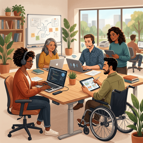
Accessibility means removing barriers so that disabled people can participate independently, confidently and equally, and website accessibility applies that principle to the websites, apps and digital services that now shape almost every part of modern life. It sounds simple when written in one sentence. The reality is much bigger, much more human and, far too often, much more frustrating.
A website can look beautiful, load quickly and contain excellent information, yet still exclude someone who cannot use a mouse, cannot see the screen, cannot hear a video, needs more time to complete a form or becomes overwhelmed by an unpredictable layout. Presence is not the same as access. Putting information online does not automatically make that information available to everyone.
I have worked in this field since 2006, and one thing has become clearer with every passing year. This subject is never only about code. It is about whether a person can book an appointment, apply for a job, buy a product, read important information, contact a service, manage money or complete a task without being stopped by an avoidable barrier.
Several years ago, I asked people on LinkedIn what the subject meant to them. The answers were thoughtful, practical, angry, hopeful and deeply personal. Some people described independence. Others described a constant uphill battle. Several talked about being included by default rather than being expected to ask, complain or campaign for the same access that other people receive without a second thought.
Those responses still matter. They remind us that standards, audits and technical guidance only have value when they improve real lives.
Accessibility Starts With Removing Barriers
The broad meaning of the word is straightforward. People should be able to reach, understand and use places, services, information and opportunities without unnecessary obstacles.
A barrier may be physical, digital, social, financial, sensory or attitudinal. Sometimes it is obvious, such as a flight of steps with no alternative route. Sometimes it is hidden inside a form, menu or piece of code that appears to work perfectly well to the person who created it.
The World Wide Web Consortium explains that disabled people should be able to perceive, understand, navigate and interact with the web, as well as contribute to it. That definition matters because it goes far beyond simply opening a page. A person must be able to make sense of the content, move around it, operate its controls and complete the purpose of the visit. You can read the W3C introduction to web access for a clear explanation of these principles.
The scale of the issue is enormous. The latest Family Resources Survey reported that 16.8 million people in the UK were disabled in 2023 to 2024, representing one in four people.
This is not a tiny specialist audience sitting at the edge of society. Disabled people are customers, employees, managers, students, parents, business owners, volunteers, friends and family members. They use the same services, make the same decisions and expect the same basic respect as everybody else.
Access is Not the Same as Availability
A common mistake is to assume that something is accessible simply because it exists.
A document may be online, yet impossible for a screen reader to interpret. A video may be available, yet useless to someone who needs captions. A form may be visible, yet impossible to submit without a mouse. A menu may look elegant, yet disappear whenever someone enlarges the text or moves through it with a keyboard.
Website accessibility means thinking about the complete journey rather than celebrating the fact that a page loaded.
Can the person find what they need? Can they understand it? Can they complete the task? Can they recover when something goes wrong? Can they do all of this with the technology they actually use?
This is why the phrase usable by everyone can be misleading when it is treated as a vague ambition. No single design will remove every possible difficulty for every person in every situation.
Good practice is about anticipating a wide range of needs, following recognised standards, involving disabled people and responding properly when a barrier is found.
The Physical World Offers A Useful Comparison
One contributor to my original LinkedIn discussion described accessible swings in playgrounds.
Many playgrounds have one specialist swing, perhaps added after a family has spent months requesting it or fundraising for it. Genuine inclusion would mean considering disabled children from the beginning and making suitable equipment a normal part of every playground.
Another person described wheelchair users being refused by taxi drivers, even when a folding wheelchair could easily fit into the vehicle.
I have seen something similar myself. A wheelchair user approached a taxi rank, and the first several taxis suddenly drove away. Perhaps they all received urgent bookings at exactly the same moment. My inner optimist would like to believe that. My experience of the world remains less convincing.
These examples are not about websites, yet they reveal the same underlying problem. The person facing the barrier is treated as an interruption, an exception or an inconvenience.
The system has been created around one assumed type of user, and everybody else must ask for special treatment.
Digital services repeat this pattern when inclusive access is bolted on later. A button is added. A plugin is installed. A statement is published. The organisation congratulates itself, while the underlying journey remains impossible for many of the people who need it.
The better approach is inclusion by default.
Accessibility Is About Real People
One of the strongest responses to my question said that both the functionality and the content of a website must be inclusive.
That distinction is important. A site can be technically impressive and still use language that excludes people. It can also contain thoughtful, respectful content while being almost impossible to navigate.
The contributor described drop-down menus that vanish or jump unexpectedly, tables that are introduced so badly that a screen reader begins announcing a stream of meaningless information, and image descriptions that have been written for search engines rather than for the person who actually needs them.
Their wider point went beyond disability. Disabled people are not one uniform group. They have different cultures, identities, beliefs, experiences and ways of living.
When organisations focus so heavily on a diagnosis or impairment that they forget the complete person, inclusion becomes shallow and performative.
How Accessibility Supports Independence
Another response described the subject as giving disabled people the ability to navigate without barriers and retain their independence.
That is perhaps one of the clearest explanations of why this work matters.
A person should not need to ask a friend, partner, colleague or support worker to complete a task that could have been made usable in the first place.
Website accessibility can determine whether someone manages their own bank account, applies privately for a job, books medical care, chooses a holiday or reads confidential information without assistance.
The barrier may look minor to the team responsible for the site. A missing form label can be one line of code. An invisible keyboard focus indicator may take minutes to correct. A badly named link can be changed in seconds.
The impact on the user may be the difference between independence and dependence.
This is also why phrases such as most people can use it are not reassuring. A service does not become inclusive because the excluded group is smaller than the included group.
Nobody would accept a lift that worked for most floors or a fire alarm that alerted most occupants. Digital barriers should not receive a softer standard simply because they are harder for decision-makers to see.
Barriers Create Emotional Weight
One person described the subject as barrier after barrier, an uphill battle that required constant advocacy, education and persistence.
That emotional burden is often missing from corporate conversations.
When a disabled person encounters one inaccessible site, the experience may be irritating. When the same person encounters barriers across banking, travel, shopping, work, healthcare, education and public services, the effect is cumulative.
Each failure sends a message that their needs were not considered.
The person must then decide whether to leave, find an alternative, ask someone else for help or contact the organisation.
Reporting the problem may involve explaining the issue to somebody who does not understand it, proving that it exists, waiting for an answer and hoping that the response is not a generic apology followed by no action.
That is labour created by somebody else. The organisation saves time during design or development, and the disabled visitor pays for that saving with frustration, lost privacy and wasted effort.
The most powerful improvement is not a perfect compliance score. It is the moment when a person completes the task and nothing remarkable happens.
No barrier. No explanation. No special request. No heroic struggle. Just an ordinary digital experience.
Inclusion By Default
Several original responses used examples from daily life.
Image descriptions should be added to social media posts without waiting for a blind person to request them. Books should be available in formats that people can use. Transport should not become a negotiation. Public spaces should not treat inclusive facilities as rare additions.
The same principle should shape website accessibility.
Captions, logical headings, useful link text, clear instructions and keyboard operation should not appear only after a complaint. They should form part of the normal design, content and development process.
Nobody needs a special reason to benefit from clear language. Nobody complains that a form was too easy to understand. Nobody abandons a checkout because the error message was too helpful.
Inclusive choices often improve the experience for everybody while remaining essential for the people who would otherwise be excluded.
Accessibility Changes How People Use The Web
People interact with digital content in many different ways.
Some use a mouse and large monitor. Others use a phone with the text enlarged. Some use a keyboard without a mouse. Others use screen readers, screen magnification, voice recognition, switch controls, captions, transcripts or customised colour settings.
The technology is only part of the picture.
People also bring different levels of concentration, memory, literacy, confidence and digital experience. A person may have a permanent disability, a temporary injury or a changing condition.
Someone may be trying to use a website in bright sunlight, on a slow connection, in a noisy environment or while holding a sleeping child. The web is used in real life, not inside the perfect conditions of a design presentation.
Blind And Visually Impaired People
A screen reader converts digital content into speech or Braille. It does not simply read the visible words from top to bottom.
It uses the underlying structure of the page to announce headings, links, buttons, form fields, landmarks, images and other elements.
When that structure is correct, a blind person can move rapidly through a page. They may navigate by headings, bring up a list of links, jump between form controls or move directly to the main content.
When the structure is poor, the same page can become a long and confusing stream of information.
A heading that has been styled to look large but is not coded as a heading will not appear in the heading list. A button that has no accessible name may be announced only as button. An image containing important text may remain silent.
A link labelled 'click here' makes little sense when heard away from the surrounding paragraph.
Meaningful alternative text is especially important. The purpose is not to describe every visible detail or force keywords into an image description.
The purpose is to communicate the information or function that a sighted person receives from the image. Decorative images may need no description at all. Complex charts may need a concise summary and a longer explanation nearby.
People Who Cannot Use A Mouse
Many people navigate with a keyboard, voice recognition or alternative input device.
Every interactive control must therefore be reachable and usable without precise mouse movement.
A visible focus indicator shows which element is currently selected. Logical focus order allows the person to move through the page in a predictable sequence. Menus must open and close properly. Dialogues must not trap the user. Buttons must respond to the expected controls. Forms must allow errors to be found and corrected.
Voice recognition adds another dimension.
A person may speak the visible name of a button or link. If the visible wording and underlying accessible name do not match, the command may fail.
Something that appears perfectly usable to a mouse user can become maddening when every spoken instruction is ignored.
One member of our testing team uses voice recognition because she cannot use her hands. Her experience reveals barriers that automated software cannot understand.
A tool may confirm that a button exists. It cannot tell us whether a person can reach it, name it, activate it and continue the journey without assistance.
Deaf and Hard-of-Hearing People
Video and audio content need alternatives.
Captions support people who are deaf or hard of hearing, while transcripts provide a flexible text version of spoken information. Audio description may be needed when important visual information is not conveyed through the soundtrack.
Automatic captions can be a useful starting point, but they require checking. Names, technical language and accents can produce remarkable errors.
Amusing caption mistakes are less amusing when the content concerns healthcare, finance, employment or legal rights.
Instructions should never depend entirely on sound. An error alert, notification or time warning must also be available visually.
Contact routes should not assume that everybody can use a telephone. Providing email, forms, text-based support or relay-compatible options gives people meaningful choice.
Neurodivergent People And People With Cognitive Impairments
Clear and predictable design can make the difference between a manageable task and an overwhelming one.
Dense pages, inconsistent navigation, moving content, vague instructions and unexpected interruptions increase cognitive load.
One original contributor described the need for easy-to-read text, fewer distractions, no flashing images and less information crammed into one space.
These are not requests for a dull internet. They are requests for information that respects the way people process and understand content.
Useful improvements include short sections, descriptive headings, plain language, consistent controls, clear progress indicators and helpful error messages.
Users should be able to pause moving content, extend time limits where appropriate and review information before making a commitment.
Colour and layout also matter. Some people find high contrast helpful, while others experience discomfort from stark combinations.
Customisation can support individual needs, but it should not replace good underlying design. The main site must work properly before optional display choices are added.
Website accessibility is not about creating one separate version for disabled people. It is about building a flexible experience that can adapt to different ways of seeing, hearing, understanding and interacting.
Accessibility Matters To Every Organisation
There is a moral case, a practical case, a commercial case and a legal case.
Organisations sometimes treat these as competing arguments, as though caring about people becomes less sincere if better inclusion also supports business performance.
The reality is simpler. Removing barriers is the right thing to do, and it also makes a service available to more people.
Why Accessibility Matters To Customers
A customer arrives with a purpose.
They may want to understand a service, compare options, make a purchase, book an appointment or ask for help. Every unnecessary obstacle increases the chance that they will leave.
The commercial damage is rarely recorded as an access problem. Analytics may show an abandoned form, short visit or failed checkout.
The organisation sees a conversion issue. The user experiences a menu they could not open, an error they could not understand or a payment process that did not work with their technology.
The lost sale is only one consequence. People talk. A bad experience may be shared with family, friends, colleagues or an online community. A good experience can build trust just as quickly.
Website accessibility gives organisations the chance to serve people who are routinely let down elsewhere.
That should not be viewed as charity. Disabled people are customers with money, preferences, loyalty and influence.
Employees Need Equal Access Too
Public facing services receive most of the attention, yet internal systems can create equally serious barriers.
Employees may need to use intranets, learning platforms, recruitment portals, HR systems, expenses tools, document libraries and communication software.
An organisation can have an excellent equality policy while requiring a disabled employee to ask a colleague for help every time they submit leave or complete mandatory training.
The words and the experience then tell very different stories.
Procurement decisions matter here. Buying an inaccessible platform can create years of difficulty, expensive workarounds and legal risk.
Asking suppliers for evidence, involving disabled users and including clear requirements in contracts is far safer than discovering the problems after launch.
Reputation Is Built Through Experience
Modern organisations publish values about inclusion, dignity and respect. Those values are tested when somebody tries to use the service.
An inclusive campaign does not repair an inaccessible checkout. A diversity statement does not compensate for an application form that cannot be completed with a keyboard. A cheerful social media post does not help the person who cannot read the text embedded inside its image.
Brand reputation is not created by saying the right things. It grows when the practical experience matches the promise.
A properly planned accessible web design service can help build that experience from the beginning, rather than treating inclusion as a repair project after launch.
Legal Duties Cannot Be Ignored
UK organisations have responsibilities under equality law, and public sector bodies have additional duties under the Public Sector Bodies Websites and Mobile Applications Regulations.
Government guidance states that all UK service providers have a legal obligation to consider reasonable adjustments for disabled people. Public sector websites and apps must meet the relevant standards and publish an accurate statement.
The exact legal position depends on the organisation, service, location and circumstances, so specialist legal advice may be needed. The practical direction is nevertheless clear.
Waiting for a complaint is not a strategy.
The official GOV.UK guidance on digital access requirements explains the duties affecting public sector bodies and the wider relationship with the Equality Act.
A properly evidenced accessibility statement can explain the current position, known barriers, contact route and improvement plan.
It should reflect reality rather than make a confident claim that nobody has tested.
Accessibility Needs More Than Automated Testing
Automated testing tools are useful.
They can identify some missing alternative text, colour contrast failures, empty labels, structural errors and other technical problems. They are fast, repeatable and valuable within a wider process.
They cannot tell you whether a journey makes sense.
A scanner may find that every form control has a label. It cannot always judge whether those labels are understandable.
It may confirm that headings exist, while missing the fact that the structure is confusing. It may see that a menu can technically receive focus, while a keyboard user cannot work out how to operate it.
It may report no critical errors on a page that a real person cannot complete.
Website accessibility must therefore be tested through several methods.
Standards Provide a Foundation
The Web Content Accessibility Guidelines provide an internationally recognised framework.
WCAG is organised around four broad principles. Content and controls should be perceivable, operable, understandable and robust.
These principles help teams examine whether information can be sensed, whether controls can be used, whether the experience makes sense and whether the code works reliably with different technologies.
Standards matter because they create consistency and measurable expectations. They also have limits.
Meeting a checklist does not guarantee an excellent experience, just as passing a driving test does not guarantee that every future journey will be graceful.
The strongest work combines standards with usability, context and lived experience.
Manual Review Finds Meaning
A trained reviewer can assess heading structure, link purpose, form instructions, error handling, keyboard operation, focus behaviour, responsive layouts, documents, multimedia and interactive components.
Manual review also allows issues to be understood in context.
A missing description on a decorative image may have little impact. An unnamed button that submits a payment may stop the entire journey.
Both might appear as technical failures, but they do not deserve the same priority.
A clear report should explain what is wrong, who is affected, why it matters and what needs to change.
Dumping hundreds of technical warnings into a spreadsheet is not support. It is admin wearing a laboratory coat.
Disabled Testers Reveal The Real Experience
Testing by disabled people shows how the complete journey behaves with assistive technology and different access needs.
At Access by Design, our team includes people who use screen readers, keyboard navigation, voice recognition and personalised display settings in everyday life.
They do not simulate a disability for an afternoon. They bring years of practical experience to the task.
Their findings often reveal problems that nobody else has noticed.
A component may technically meet a criterion while remaining exhausting to use. A journey may be possible only after repeated trial and error. A message may be announced at the wrong time. A change of context may leave the user lost.
A professional website accessibility audit should connect technical evidence with this human experience.
The result should give developers clear fixes, give managers sensible priorities and give the organisation a realistic route forward.
Retesting Confirms Whether Changes Worked
Finding a problem is only the beginning. Fixes need to be checked.
A developer may resolve the original issue while creating another one. A visual change may improve contrast but hide the focus indicator.
A script adjustment may help one screen reader and disrupt keyboard behaviour. Retesting confirms whether the barrier has genuinely been removed.
This is why the work should be treated as a cycle rather than a single pass.
Test, prioritise, fix, retest and learn. The lessons should then feed into future content, design, procurement and development.
Accessibility Is A Continuing Commitment
The person who responded to my original question by saying that the work is never done but always improving had grasped something important.
Websites change. New pages are published. Plugins are updated. Campaigns are launched. Staff members join and leave. Videos are uploaded. Forms are replaced. Third-party tools are embedded.
A site that was carefully reviewed can gradually collect new barriers if nobody owns the ongoing process.
This does not mean perfection is impossible or that organisations have an excuse to delay. It means good governance matters.
Start With A Clear Picture
The safest first step is to understand the current condition of the site.
Automated checks can offer an initial indication, but a proper review should include manual assessment and real user testing.
The aim is not to produce the largest possible list of faults. The aim is to identify barriers, understand impact and create priorities that the organisation can act upon.
Critical journeys deserve particular attention.
A university may focus on course search and applications. A retailer may prioritise product discovery, checkout and account management. A healthcare provider may need to examine appointment booking, results and urgent contact routes.
Fix The Foundations First
Some problems appear across every page because they are built into templates or shared components.
Navigation, headings, colour contrast, forms, focus styling and cookie controls can affect the whole site.
Correcting a shared component may remove hundreds of repeated failures. Updating one isolated blog post may help only that page.
This is why prioritisation should consider reach as well as severity.
Content teams also need clear rules. Meaningful headings, useful links, accurate image descriptions, usable documents and properly captioned media should become normal publishing practice.
Website accessibility works best when those habits are built into everyday decisions rather than saved for an annual review.
Give People A Route To Ask For Help
Even a well-maintained site may contain a problem. Visitors need a clear way to report it or request information in another format.
The contact route should be easy to find and should offer more than one method where possible.
Responses should be respectful, practical and timely. The person reporting the barrier has already spent time discovering it. They should not then be required to fight through a customer service maze.
Feedback is valuable evidence. Patterns in complaints can reveal weaknesses in systems, training or procurement.
Organisations that listen well often improve faster.
Build Knowledge Across The Organisation
One enthusiastic person cannot carry the whole responsibility indefinitely.
Designers, developers, content editors, procurement teams, project managers and leaders all influence the outcome.
Training should be relevant to each role. A content editor needs different details from a developer. A procurement manager needs to know what evidence to request. A leader needs to understand risk, resources and accountability.
The goal is not to turn every employee into a technical specialist. The goal is to help each person make better decisions within their own work.
Keep Disabled People In The Process
Disabled people should not appear only at the final testing stage, after every important decision has already been made.
Their experience can shape research, design, development, content and evaluation.
Involving people early does not remove the need for standards or expert review. It adds context. It helps teams understand what a requirement means in practice and prevents confident assumptions from becoming expensive mistakes.
This principle returns us to the original question.
What does this subject mean to you?
For one person, it means independence. For another, it means not having to explain the same barrier again.
For a business, it may mean reaching more customers and protecting trust. For a developer, it may mean writing code that works with more technologies. For a content editor, it may mean choosing clearer words. For a leader, it means accepting responsibility for the experience the organisation creates.
Website accessibility is ultimately about whether people can participate.
It is about designing the digital world so that disabled people are expected, welcomed and respected from the beginning.
My TED Talk explains this in a deliberately non-technical way and explores why digital barriers matter so much. You can watch my TED Talk about inclusive websites and share it with colleagues who are beginning to explore the subject.
Our work in website accessibility began in 2006. Access by Design combines design, development, technical review and testing by disabled people to help organisations understand where they are, what needs to improve and how to move forward without panic or pointless shortcuts.
A conversation is often the simplest place to begin. Tell us what your website does, who needs to use it and what concerns you have. We will help you identify the next sensible step.
Change the World, One Website at a Time.

Would you like to speak with people
who understand inclusive web design?
Whether you are planning a new website, reviewing an existing platform or trying to understand your accessibility obligations, we would love to help.
Please get in touch to discuss your project, accessibility goals or digital challenges.