Why accessibility plugins are a bad idea

I am passionate about website accessibility for disabled people. I have the privilege of knowing many other people who feel the same. We are all trying, in our own way, to do what we can to promote the cause and change minds.
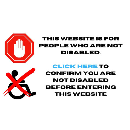
Nobody wants to have a website that is inaccessible for disabled people, however over 97% of the Home Pages of 1 million websites tested last year, had detectable accessibility failures. It is a problem.
To solve this, websites might use a plugin of some kind, to “fix” the problem. The difficulty is that, whilst these plugins appear to offer a lot of different solutions (contrast options, different text sizes and a host of other features) they do this by creating an overlay. An overlay is where you have code that is laid over the top of other code and this causes further problems.
Mede, one of my fab team of website accessibility testers, is blind and uses the screen reader JAWS. Screen readers do not pick up overlays, or they do not work well with them. I have witnessed this first-hand, where her screen reader was happily reading out the content of a page that was behind a large menu that contained all the different pages on the website she could navigate to. She was completely unaware of this overlay. I asked her to reload the page to make sure that this was actually happening.
If a cake is rotten and you cover it in icing, it may look nice but it is still rotten. You need to throw the cake away and make it again. However, that is not an easy solution when it comes to your website.
So, in the meantime, you use your accessibility statement to reach out to disabled visitors, explaining the issues that they may have with your website and offering them alternate ways of doing business with you. It is not about being perfect, it is about having an honest dialogue with your customers, reaching out to them.
The website accessibility guidelines have been around since 1999. There is no secret to this. Please do not look to a plugin to fix your accessibility issues because that will create more challenges. Focus on your accessibility statement instead.
If you would like to learn more about website accessibility, please follow this link to watch my TEDxTalk: https://www.youtube.com/watch?v=Oj3a8NFqpLU&t=21636s
Clive Loseby
Access by Design. Accessible Websites, Beautifully Designed.
Outstanding web audits
Award-winning web design, Chichester.
Caption:
A stop sign and a wheelchair sign with a red cross on it. Text reads: This website is for people who are not disabled. Click here to confirm you are not disabled before entering this website. In 2021, out of 1 million websites tested, 97.4% of the Home pages had detected accessibility failures. https://webaim.org/projects/million/#wcag


