Click here. Er...click where, exactly?

Think for a moment
Have you ever found yourself staring at a webpage, scratching your head, wondering, "Click here? Click where?" You're not alone; it's like the universal link mystery phrase.
So, let's think for a while about this common "Click Here" or just "Here" situation. You see, it's not as friendly and inclusive as it sounds. Imagine not using a mouse – clicking is out of the picture, and even if you could click, where on Earth should you be aiming? Inclusivity is key!
With Voice Recognition you have to use the phrase "Click Link," and Screen Readers dutifully announce "Link." However, we are not talking about this.
The real issue is that "Click Here" is way too vague. It's like saying, "Go there" without pointing the way. Let's fix that, shall we?
Instead of:
- Click Here to sign up for our mailing list.
- Click Here to read our policy on Equality, Diversity and Inclusion.
How about:
- Sign up for our mailing list.
- Read our policy on Equality, Diversity and Inclusion.
See the difference? It's crystal clear and user-friendly. No guessing games. Just straightforward action.
Now, some might suggest replacing "Click Here" with "Follow this Link." This sounds inclusive, right? Well, yes it is, but it comes with a twist. The link text becomes longer, and picture this – a screen reader cheerfully announcing, "Link, follow this link to sign up for our mailing list." A bit of a mouthful, isn't it?
In the grand scheme of web etiquette, let's strive for simplicity and clarity. Your links should be like a friendly guide, not a riddle. People want to know where they're headed, not play hide-and-seek with the cursor.
So, next time you're adding links, ditch the generic "Click Here." Give your audience the gift of direct, no-nonsense instructions. It's not just about being mouse-friendly; it's about being everyone-friendly.
Let's make the internet a friendlier place, one link at a time. It is how we change the world.
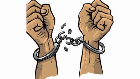
Caption: Two clenched fists, pointing upwards, in handcuffs that have been broken apart, representing the idea of broken links, which is just about as useful as Click Here links.
Would you like to find out more?
If you would like to find out more about website accessibility, please follow these links:
Watch my TED Talk
Find out more about web audits
Discuss having an web audit of your website
Have a 1-hour consultation on any aspect of website accessibility
Clive Loseby
Access by Design
Beautiful, WCAG 2.2 Compliant, Accessible Website Design
Delivering an Outstanding web audit
Award-winning Web Design, Chichester


