How do you balance aesthetics with accessibility?

Two images, same website
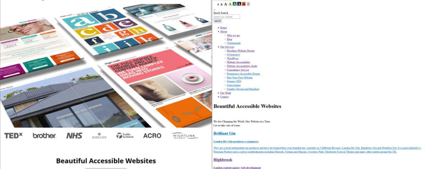
There are two images above. The image on the left is of our website. The image on the right is also of our website. The content is identical. One perhaps looks rather more attractive than the other but if you are blind and are using a screen reader, they are the same.
The difference between the two is the stylesheet. The stylesheet determines how a page is laid out, which fonts are used, the size of the text, the colour palette and so on.
Mobiles, tablets and monitors all have different screen sizes so the stylesheet is used to display the content in a way that works most effectively for that screen size.
This is all pretty basic stuff. The stylesheet controls how the website looks and, as the screen size is changed, the content gets laid out differently.
What else can we do with a stylesheet?
With inclusive website layout, we just take this concept and extend it a little further.
Rather than just specifying the size of the font in the standard view, we can also specify the font size in the large size version and extra-large size version.
Rather than just specifying the foreground and background colours, we can also specify different combinations of foreground and background colours, so people can choose a combination that works for them.
We can offer a plain text version and even allow visitors to choose a different colour combination, in case white backgrounds give them headaches.
Put all of that into a toolbar and there you have it. Giving people a choice over how the website looks whilst defining their choices allows you to strike that balance between aesthetics and accessibility.
Do not use a 3rd party accessibility overlay!
By the way, this has to be done within the website’s code. Do not use 3rd party software to do this for you. This may appear to give your visitors similar choices but actually makes your website inaccessible for many disabled people.
A journey of discovery
I work web designers when I undertake my web audits and it is a journey of discovery for them. Once they realise that technically it is actually not that difficult, it can completely change their mindset, which is why I love what I do!
Caption: On the left is a screenshot of the Access by Design website, showing their accessibility tool, navigation, and a large interactive graphic displaying some of their portfolio.
If a mouse hovers over any one of them, it is raised gently and settles down again as the mouse moves away from it.
On the right is a screenshot of the same website in a plain format, with all of the accessibility options, page links and text over a plain white background
Would you like to find out more?
If you would like to find out more about website accessibility, please follow these links:
Watch my TED Talk
Find out more about web audits
Discuss having an web audit of your website
Have a 1-hour consultation on any aspect of website accessibility
Clive Loseby
Access by Design
Beautiful, WCAG Compliant, Accessible Website Design
Delivering an Outstanding web audit
Award-winning Web Design, Chichester


