fallback

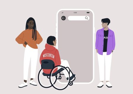
Why Mobile Accessibility Matters More Than Desktop In 2025
Mobile devices are now the primary way many people access the internet. This shift has changed how users interact with websites and how organisations must think about accessibility. A mobile website is not simply a smaller version of a desktop site. It is a different experience with different expectations and different barriers.
Mobile accessibility has become critical because people use their phones in every environment. They browse while travelling, while working, while resting and while managing daily tasks. A website must adapt to these situations and remain clear, usable and reliable. When it does not, users leave. They do not try again later.
Mobile Screens Create Unique Challenges
A mobile screen is smaller, which means content must be structured carefully. Text must be readable. Buttons must be large enough to tap without accidental movements. Layouts must adjust smoothly when devices change orientation.
On many mobile sites, text becomes cramped. Menus shrink too far. Buttons overlap. Content jumps around when the user zooms. These issues create frustration and stop users from completing tasks.
Mobile accessibility focuses on clarity and comfort. Real users need room to read, space to tap and layouts that adjust without breaking.
Zoom And Scaling Must Work Properly
Many users rely on text scaling or zoom to read comfortably. Mobile devices allow users to enlarge text across apps and websites, but many sites do not respond correctly to these preferences.
When text scales, content can disappear off the screen. Buttons may become obscured. Lines of text can overlap or break apart. A user may need to scroll sideways, which is a sign of poor design.
Mobile accessibility requires careful testing of zoom and text resizing. These adjustments must work smoothly so the website remains readable at every level.
Colour And Contrast Requirements Are Different On Mobile
Mobile users often browse in bright environments such as outdoors or on public transport. Reflections and glare make low contrast designs even harder to read.
A colour combination that looks acceptable on a laptop can become completely unreadable on a phone. Designers often underestimate how much environmental light affects mobile users with visual impairments.
Higher contrast and solid typography are essential for mobile viewing. These changes benefit everyone, not just disabled users.
Mobile Assistive Technology Behaves Differently
Screen readers, screen magnifiers and voice control tools operate differently on mobile devices. A design that works well on desktop may behave unpredictably on a phone.
Mobile screen readers use gestures instead of keyboard commands. Buttons that are too small or too close together become difficult to activate. Menus that rely on hover behaviour collapse because hover does not exist on touch screens.
Real mobile testing is essential because mobile assistive technology does not mimic desktop behaviour. Users navigate differently, and the website must support these patterns.
Touch Targets Must Be Large Enough
Touch targets are the size of areas users tap to activate links or buttons. Many mobile sites use tiny touch targets that are difficult to select accurately. This is a common barrier for people with motor impairments, hand tremors or limited dexterity.
Small targets cause accidental taps. They interrupt user journeys. They reduce confidence and make tasks harder than necessary. Mobile accessibility ensures every button and link is large enough to tap comfortably.
Forms Can Break Easily On Mobile Devices
Forms must work smoothly on mobile. Many fail due to spacing issues, unclear labels or elements that shift when the keyboard appears.
When users try to enter information, fields may become hidden. Warning messages may not appear where the user can see them. Submit buttons can become trapped off screen. These problems are not always visible on desktop.
Testing must confirm that forms remain clear and functional throughout the process.
Real Mobile Testing Shows The Truth
Mobile accessibility requires real testing on actual devices. Automated tools and desktop simulations cannot replicate the behaviour of touch screens, gesture navigation, zoom preferences or real world lighting conditions.
Testing on phones shows what users genuinely experience. It reveals how layouts respond, how buttons behave and how content adapts under pressure. A mobile site must be strong enough to handle these variations.
Insights from this process are included in our structured accessibility audit which explains the root causes and offers clear guidance for improvement.
Mobile Accessibility Helps Every User
A mobile website that works well is easier for everyone to use. Clear text helps users read more comfortably. Larger buttons reduce mistakes. Better contrast improves visibility. Strong structure supports smoother navigation.
Mobile accessibility is not only about compliance. It is about creating a website that respects the reality of how people browse today. It strengthens trust and helps visitors complete their tasks without frustration.
A website built with mobile accessibility in mind is a website that welcomes every user.


Would you like to speak with people
who understand inclusive web design?
Whether you are planning a new website, reviewing an existing platform or trying to understand your accessibility obligations, we would love to help.
Please get in touch to discuss your project, accessibility goals or digital challenges.