Buttons and Links - common misconceptions

This is an issue.
In my web audits I frequently come across a problem; buttons that visually look like buttons but are actually coded as links.. Sometimes it's the way around.
So what does this mean exactly?
According to the World Wide Web Consortium (W3C) a button is a widget that allows users to trigger actions or events such, as submitting forms, opening dialogs canceling actions or performing deletions.
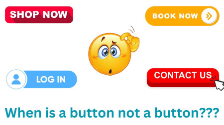
The examples of buttons shown in the graphic are illustrations of this concept.
However what we often find is that these buttons are mistakenly coded as links
Why does it matter?
Let me explain with an example;
Iona, who is a member of my testing team uses Dragon dictation to issue commands to her computer.
Due to discomfort while using a mouse or keyboard she relies on voice commands like "click link" or "click button."
When Iona says "Click Button " she expects the buttons on the web page to be highlighted for selection.
Unfortunately none of the buttons she sees are highlighted in response, to her command.
Sometimes Dragon doesn't always recognize Ionas voice commands so she often needs to repeat a command just to make sure if it's a problem, with Dragon or the website.
To make things worse the Search icon is usually coded as a button even though it may be the button on the page visually.
However there might be buttons that don't look like buttons.
If theres one button it gets automatically selected when she says "Click Button."
Sometimes a search box pops up as an overlay.
She can't even close it using voice commands because the close "button" hasn't been coded properly.
Once Iona realizes that the buttons that appear to be buttons aren't actually coded as such she then says "Click Link ".
Usually numbers appear next to these "buttons" so she can choose the one she wants.
It takes a few seconds.
This process becomes more and more tiring, over time.
While this may not sound too difficult initially since many of the websites we evaluate lack consistency on each page this process has to be repeated over and.
The cumulative effect is truly exhausting.
Fortunately there is a solution.
In fact the solution is quite straightforward.
If something appears to be a button it should be coded as such.
Naturally I understand that buttons serve functions that differentiate them from links.
However since web designers often style links to resemble buttons, for reasons I believe they should be coded accordingly.
Caption; Four website buttons labeled "Shop Now " "Book Now " "Log In " and "Contact Us" are positioned around a cartoon image of a face scratching its head.
Text below reads; "When does a button cease to be a button???"
Would you like information?
Lets discuss the possibility of conducting an web audit for your website.
Have a one hour consultation on any aspect of website accessibility.
Clive Loseby
Access by Design / Access, by Audit
We create WCAG websites that are beautifully designed
delivering outstanding WCAG 2.2 web audits


